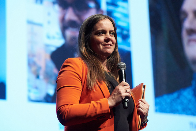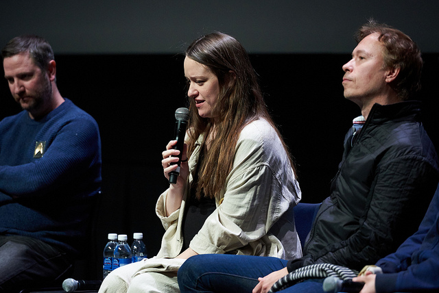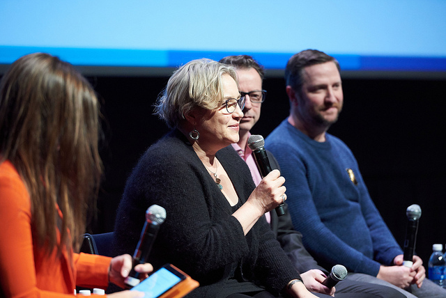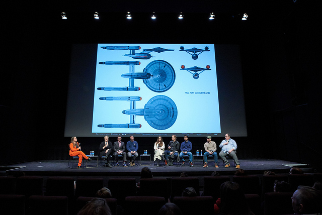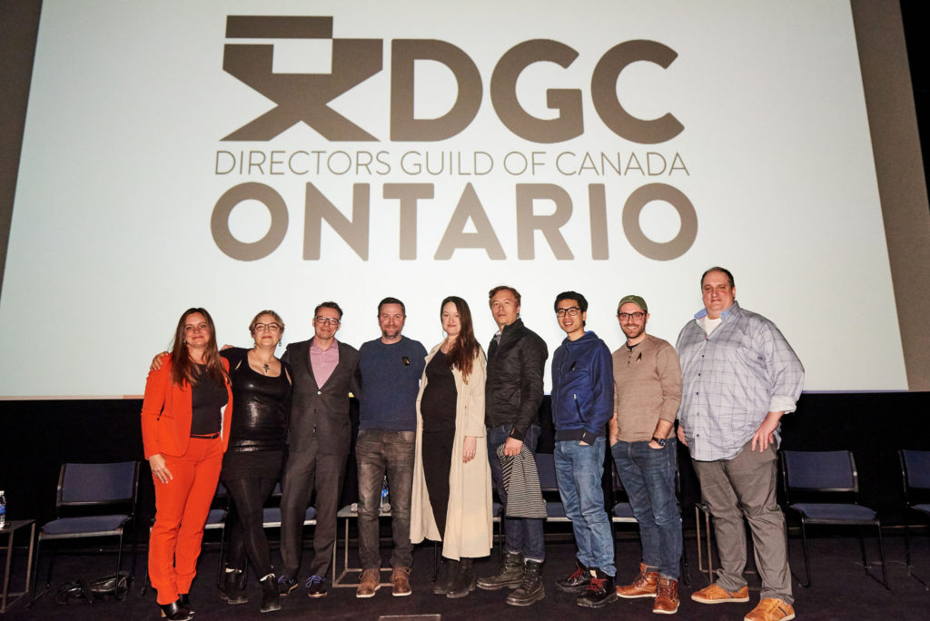
(left to right) Jody Clement, Tamara Deverell, Joshu De Cartier, Matt Morgan, Emilie Poulin, Michael Stanek, Andy Tsang, Chris Penna, Timothy Peel. | Photo:Tobias Wang
As part of filming in Toronto, Star Trek: Discovery has leveraged the talents of many amazing Canadian film industry creative professionals. Last weekend we got a chance to hear directly from a group of them about what it’s like to work as part of Discovery‘s creative team, at an event called “Designing the Final Frontier,” hosted by the Ontario chapter of the Directors Guild of Canada.
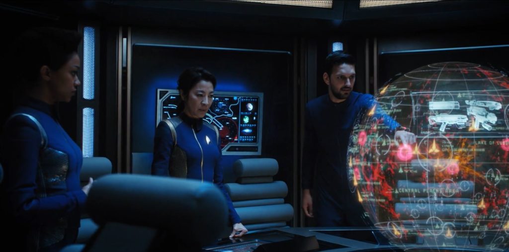
The theatre was packed as the lights dimmed for a screening of the Season 1 finale, “Will You Take My Hand?” On the big screen the episode looked and sounded stunning. It was really easy to appreciate all the little details, from the luminescent tattoos in the Orion tattoo parlour to the dramatic map of the Klingon homeworld.
Even cooler was the panel after and getting to learn more about which DGC members did what to make the episode look and feel as good as it did.
The panel moderator was Jody Clement, Star Trek Discovery‘s Art Director. Clement has a long list of credits, including three seasons of art direction on one of my sci-fi faves, Orphan Black.
The panelists included Production Designer Tamara Deverell; Supervising Art Director Joshu De Cartier; Set Designers Matt Morgan, Emilie Poulin and Michael Stanek; Graphic Designer Andy Tsang; Set Designer and Concept Illustrator Chris Penna; and Motion Graphic Designer Timothy Peel (the one responsible for those Qo’noS maps as well as pretty much everything you see on a computer monitor on the show).
The panel started with a virtual walk-through of the DSC set, including the bridge, which was 2-3 times larger than any other Star Trek bridge, apparently a shooting requirement set by Bryan Fuller. The original was also two storeys tall. Matt Morgan said the bridge took at many months of drawing and construction to create, with Morgan and Du Cartier working on more than 160 drawings over nine months. 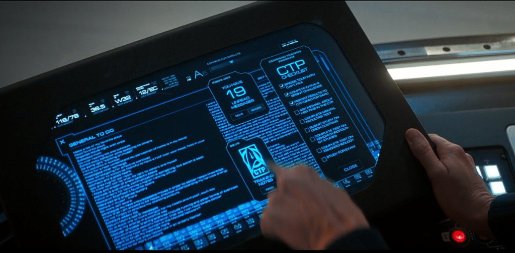
The bridge has 120 display screens, run by 84 computers, so that’s a lot of work for Peele and his team. In case you were wondering, I asked and this included writing Tilly’s to-do lists seen in S2E2, “New Eden,” which were inspired by one of the women in the department’s actual to-do lists.
The art department does all the initial concepts for sets and graphics, “so we all have the same vision of the filmscapes from very early on,” said Deverell. So if you caught the nod to TOS in the positioning of the ship’s warp core in Season 2, or how the Orion cabaret in “Will You Take My Hand?” drew its use of columns and draperies directly from “The Cage,” these are the folks to thank for that. (If you’re interested in looking at concept art and sketches from the ship sets, you can see examples at TrekMovie.com.)
Next up the panel talked about everything we saw at the Orion black market on Qo’noS. The idea to go to the black market came about because, Deverell says, the writers wanted to do something not seen before on the Klingon homeworld, and the art department knew a black market would be fun. Many sets were repurposed from other episodes, with the Terran throne room turned into the Orion cabaret, and Terran crew quarters renovated to become the Shrine of Molor.
Like so many aspects of Discovery, there are so many layers of detail you don’t always catch the first time watching. For example, Klingon graffiti that actually makes sense in Klingon, with phrases like, “Your mother has a smooth forehead.”
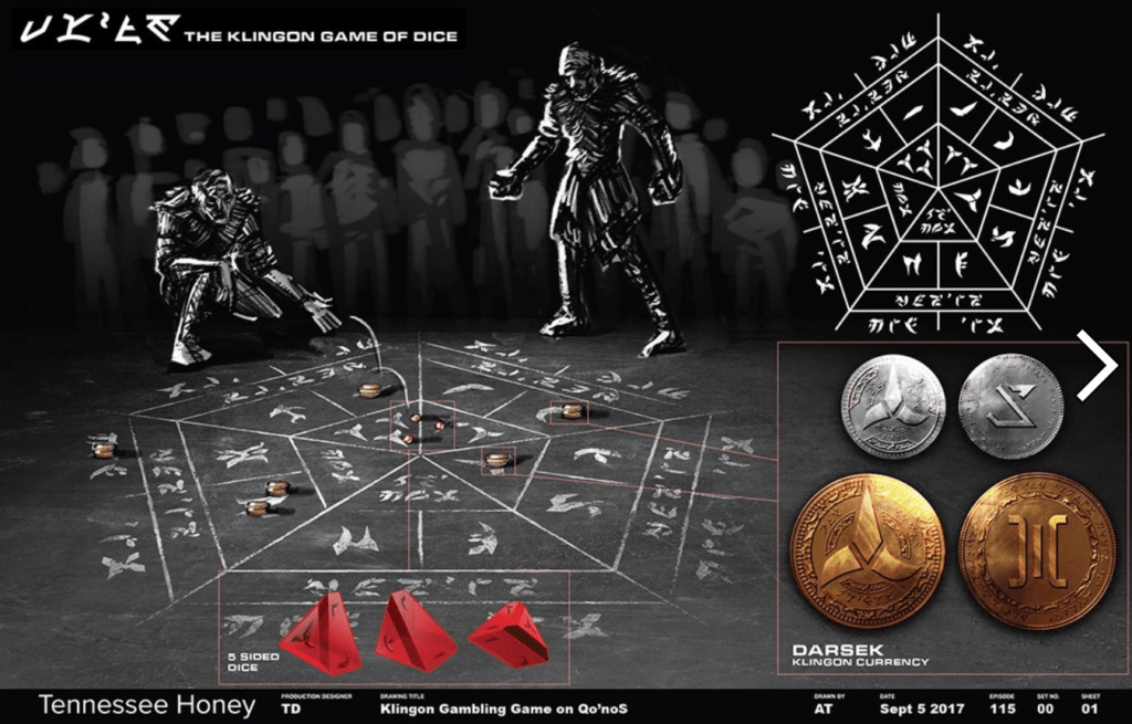
The Klingon dice game t’Sang was designed by, and named after, Graphic Designer Andy Tsang. Tsang not only gave the game a look and feel but also playing pieces and rules that the team taught the actors and director, to add a sense of realism.
As for the tattoo designs? Everyone on stage had a hand in that, with Tsang and Penna leading the monumental task of drawing hundreds of tattoos.
Set designer Emilie Poulin talked about designing the Shrine of Molor set, though the final filmed product was so dark it was hard to make out the incredible level of detail, including many ingeniously salvaged pieces from the sarcophagus ship.
But Poulin’s favourite project for Discovery so far has been designing the huts in Saru’s village on Kaminar, seen in the Short Treks episode “The Brightest Star.” The village was filmed at Scarborough Bluffs (in Toronto) and though the team was originally directed to build something like Musgum mud huts, they decided they could be much more creative than that.
“I took the prosthetic they made from Saru’s face and sketched it and extruded it,” said Poulin, who then incorporated geometry from nature – including armadillos and shells. “It ended up looking a bit like a piece of female anatomy,” Poulin said, hence the nickname “the vagina huts.”
During the Q&A we learned more about the art and design work on Season 2, including the “New Eden” stained glass windows, that had to be redone every time the writers edited the script, because they were supposed to reflect the stories. (TrekMovie has a great interview with Deverell about the Season 2 look and feel, if you want to learn more about things that weren’t covered in the panel, like the design of the Section 31 ship.)
For me, the most interesting question raised was about the wounded crewman we see using a wheelchair in “Magic to Make the Sanest Man Go Mad” and “Brother” (played by an actor who uses a wheelchair, George Alevizos). The audience member asked whether accessibility was taken into consideration designing the sets, and Tamara Deverell replied, “the ship is wheelchair-friendly.”
By way of background, Deverell said they had long discussions about why they would not show disability as something that needs to be “cured,” which was an important point. For more on the “cure” narrative and why it’s so problematic, check out our podcast episode on disability and ableism in Star Trek.
Deverell also said that the Discovery creative team had actually wanted to have a lead character who uses a wheelchair. “It was important to cast someone actually in a wheelchair,” she said, which seemed to imply they’d had difficulty finding someone in a wheelchair to fill a lead role. (I did notice the use of the term “wheelchair-bound” during this discussion, which was unfortunate, but I’m pretty sure unintentional. Teachable moment – here’s why you should use terms like “wheelchair user” or “person who uses a wheelchair” instead.)
It would be easier to accept the reasoning for a lack of a lead character with a disability if they had found occasions to increase the profile of Alevizos’ character. At this point he hasn’t even had on-screen credit for his role, nor a name. But Deverell said we will be seeing other wheelchairs later this season (Pike maybe? There is a good opportunity to re-do that story right), and noted that the wheelchairs they design are both futuristic and functional because the prosthetics designer actually was a wheelchair designer himself.
Every member of the Discovery creative team brings something different to the table, including different background knowledge of Trek. Peele self-identified as the biggest Trek fan, who’d seen all the non-animated episodes and couldn’t believe it when they got to work with Jonathan Frakes. Deverell grew up on TOS and most of the rest on TNG. Poulin hadn’t seen any before she got hired on Disco, and said she had to do a lot of research, but appreciated the creative freedom that came with not having predetermined opinions.
“There is definitely a weight to designing for this franchise,” said Matt Morgan.
Deverell said that with Discovery, the audience has higher expectations for the art and graphics, but “it really is a Star Trek thing to evolve and push forward…[Discovery] is still Star Trek; it still has the same themes.”
Big thanks to the Ontario division of the Directors Guild of Canada for putting on such a great event, and giving us permission to use the above event photos.
